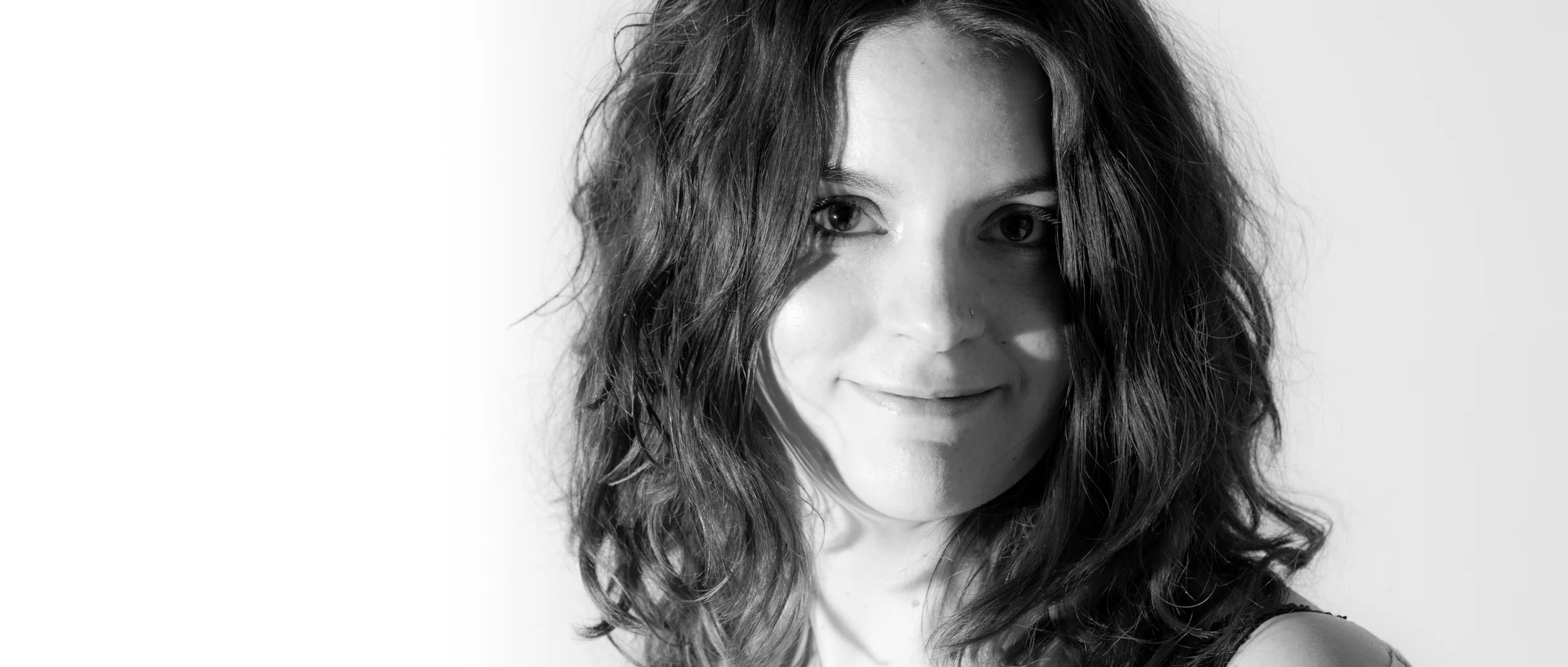
Although I do not consider myself foremost as a portrait photographer, I am a strong believer in learning every photographic technique, as you never know when you can adapt those skills to your chosen subject area.
I was chatting with a wedding photography friend, Chandan Atreya, the other day about portraits and the topic of where was acceptable to crop the model came up in conversation. I remembered seeing this diagram a few years back and had found it useful so decided to dig it up again to share with you.
It is a cheat-sheet depicting where you can 'crop' a subject, either in camera by framing or in post-processing, to give the "best" (or at least less likely to look weird) portrait. The article by DigitalCameraWorld.com states correctly, that bad cropping can ruin a great portrait. So bare this in mind next time you a framing a shot or editing a shoot! :)
While writing this, Jared Polin aka FroKnowsPhoto, made this video which you might also find interesting! :)
Quick question... Does this apply to wildlife too? ;)
Green lines - OK to crop a portrait here.
Red lines - Looks odd to crop here.
I got this image from DigitalCameraWorld.com


